Project
Adyta
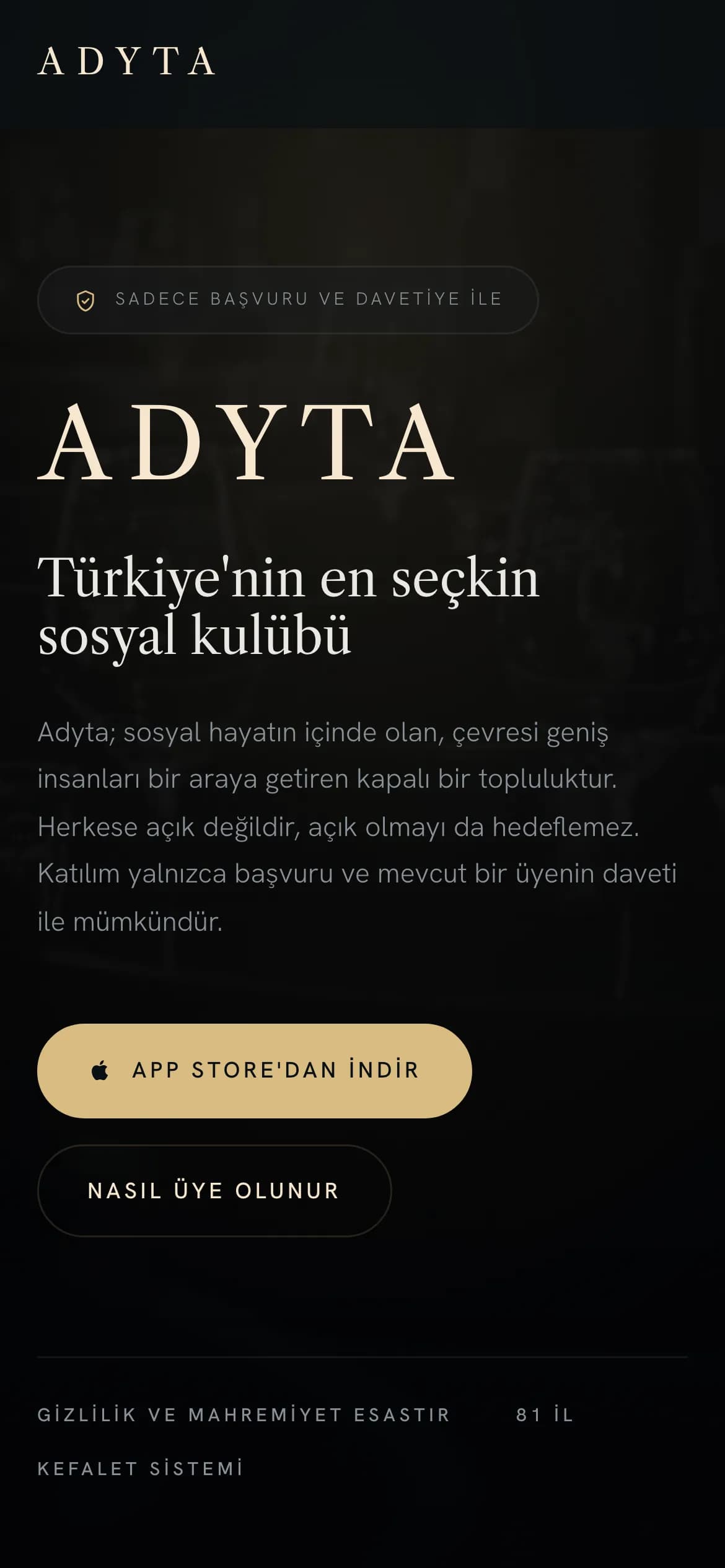
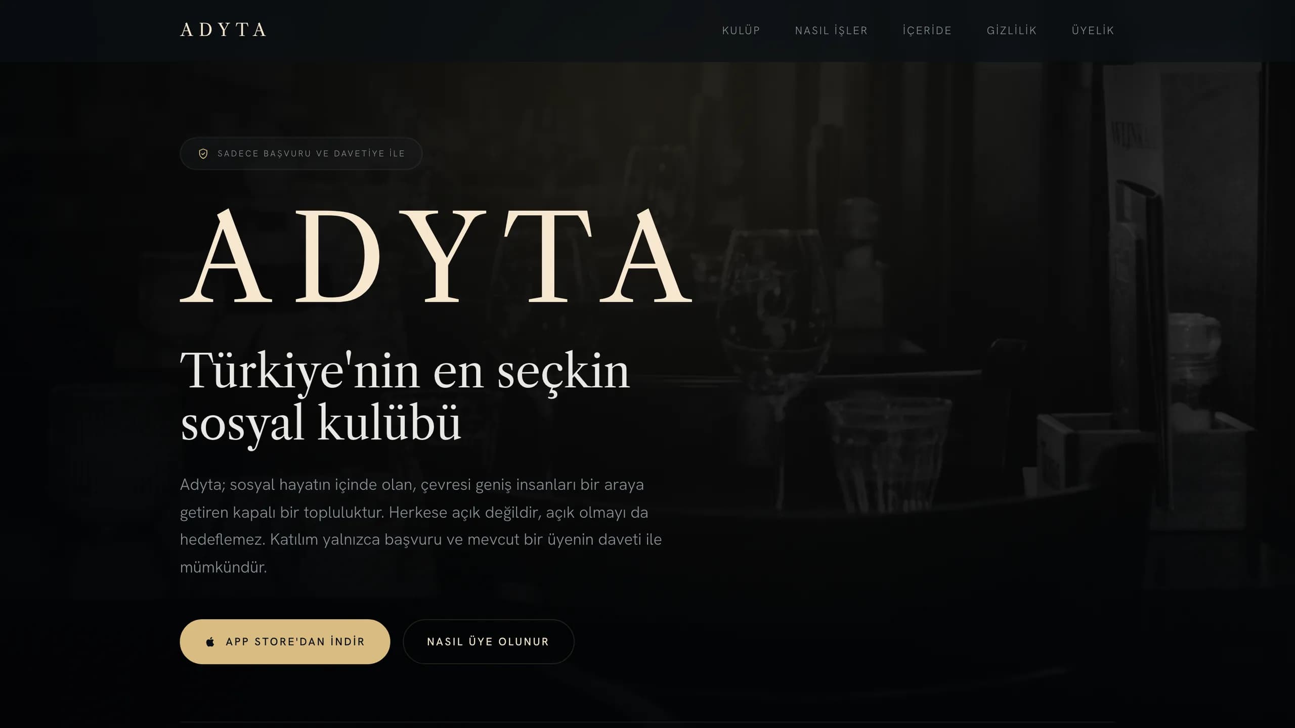
The aim: explain an application- and invite-only club to people outside it, then send them to its iOS app. Membership steps and privacy rules, laid out.
Project facts
- Sector
- Private Social Club
- Year
- 2026
- Live site
- adyta.app(opens in a new tab)
- Tags
- App Landing Page
- Static HTML/CSS
- App Store
- Privacy Pages
About the project
Nobody walks into Adyta off the street: joining takes an application plus an invite from someone already inside. The site's job is to show curious visitors what the club is like and get them to its iOS app on the App Store.
The process is clear before anyone applies
Membership moves through four stages, and the site gives each one its own row: apply, get sponsored by a member or join the waiting list, go through review, then become a member. Before that, the homepage describes who the club is for: well-connected people in the thick of social life who bring their circles together. Thanks to that order, visitors know what they are applying to before they download the app.
What's inside, and how privacy is handled
The social map, the member directory, gatherings that members host, and chats that open only when both sides agree each have a section with its own photography. Privacy isn't tucked away on another page: locations on the map are only approximate, there are screenshot alerts, and compliance with KVKK, Turkey's data protection law, is spelled out. For a private club, trust deserves as much room on the page as features do.
Answers at the moment of decision
The questions that come up before paying have their own support page, covering deleting an account, refunds, canceling a subscription, security, and membership in general. Membership is monthly or yearly, with the two options on side-by-side cards and payment handled by the App Store. Two more pages cover the legal side: the terms of use and the data protection notice. Technically, a static site was all it took: a dark, editorial design and links to the App Store.